Touch targets
A fingertip is roughly a centimetre wide and carries no cursor — the size rules that Apple and Google publish exist because of that single physical fact.
A fingertip lands about a centimetre wide, and covers the target it is aiming at.
Photo: Solen Feyissa / Pexels
The finger is not a mouse
A cursor has a point. A fingertip does not. When a finger lands on a screen, the contact patch — the ellipse of flesh that actually touches glass — spans somewhere between eight and twelve millimetres for most adults, and the nervous system registers the touch a few millimetres from where the skin actually presses.
The finger also occludes what it touches: the very thing you are trying to hit disappears under your hand at the moment of contact. These two facts together — imprecision and occlusion — are why touch interface design cannot simply inherit the conventions of the desktop.
Paul Fitts ↗ formalised the underlying insight in 1954: the time required to move to a target is a function of the distance to it and its size. Smaller target, more time, more error. The law was derived from pointing tasks — stylus work, industrial assembly — but it transferred to touchscreens with uncomfortable accuracy.
Make a button small and users will miss it, slow down approaching it, or simply abandon the interaction. The cost of a miss on a touchscreen is not just a wasted click; it is an accidental tap on whatever sits adjacent.
What the guidelines actually say
Apple's Human Interface Guidelines ↗ specify a minimum tappable area of 44 by 44 points. A point in iOS is a resolution-independent unit that scales with screen density, but at standard density it maps directly to pixels; on a retina display the rendered pixels double while the physical size stays the same.
44 points, 48 density-independent pixels: two units, one measurement of the hand.
Photo: Brett Jordan / Pexels
The practical floor is a target that subtends roughly seven to eight millimetres of physical screen — slightly under the centimetre fingertip, which is intentional. The screen reduces the contact patch to a single touch point near its centre, so a target only has to catch that point, not contain the whole finger; the floor trades a little accuracy for screen space, and larger targets remain easier to hit.
Google's Material Design sets 48 by 48 density-independent pixels as its equivalent minimum, arriving at roughly the same physical dimension by a different unit system. Both specifications share a common ancestor: research into finger-input error rates conducted in the mid-2000s as the first capacitive touchscreens reached consumers.
The physical substrate
Lifted out of the flow
- fingertip contact patch — roughly 8–12 mm across; not a point, not consistent across users
- Fitts's law — target acquisition time rises as size falls and distance increases; applies directly to touch
- occlusion — the finger covers what it touches at the moment of contact, removing visual confirmation
Steven Hoober's field studies of how people actually hold and operate phones — conducted in naturalistic settings, not labs — documented the gap between what designers expected users to do and what they actually did, and fed directly into the thinking around minimum interactive sizes.
These numbers are floors, not targets for ambition. A destructive action — delete, unsubscribe, cancel a purchase — benefits from a larger tap area than the minimum, partly because the user approaches it hesitantly and is more likely to drift, and partly because the cost of a mistap is higher.
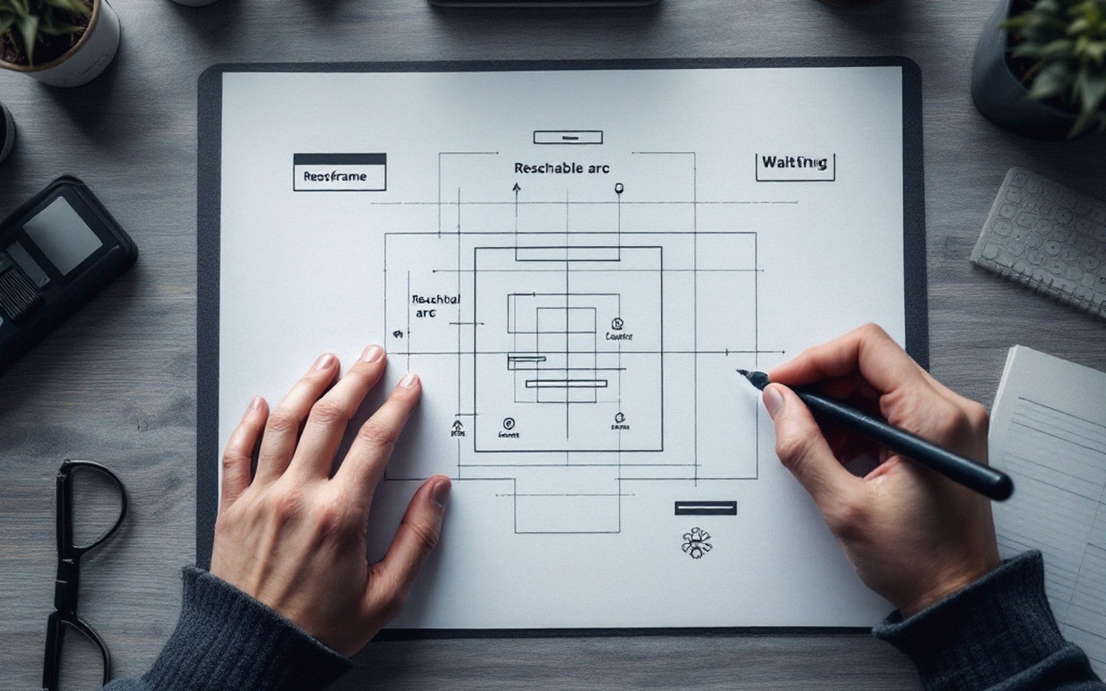
Target size is checked at the size it ships, not the size it is drawn.
The guidelines acknowledge this asymmetry: generous targets where failure is expensive, tighter targets only when layout forces the issue and the action is low-stakes.
Spacing is part of the spec
A 44-point target crammed against an adjacent 44-point target is worse than either target alone. The finger's contact patch can bridge the gap; the device cannot tell which element was intended. Both guidelines recommend minimum spacing between interactive elements — eight points in Apple's system, eight dp in Material — so that a slightly off-centre tap resolves unambiguously to one target.
Apple HIG minimum — 44 × 44 points tappable area
In a game context this matters as much as in a utility: action buttons placed close together on a time-pressured interface will produce mistaps that players attribute to bad luck when the real cause is bad layout.
The visual size of an element and its tappable area need not match. A small icon can sit inside an invisible tap target larger than itself, so the design reads as delicate while behaving as robust.
Also worth having to hand
Lifted out of the flow
The numbers
- Google Material Design minimum — 48 × 48 dp tappable area
- both resolve to approximately 7–9 mm physical size at standard screen densities
- recommended inter-element spacing — 8 points / 8 dp between adjacent interactive elements
Mobile game interfaces use this technique constantly — a close button rendered as a small glyph in a corner whose actual tappable region extends well beyond its visible boundary. The player never notices the padding. They just notice that the button works.