The reachable arc
The thumb is not a stylus. It pivots from the heel of the hand, sweeps a curved path, and makes most of a screen comfortable to hit — but not all of it. That asymmetry is a constraint, and the best mobile interfaces are designed around it.

The pivot sits at the heel of the hand: everything the thumb reaches, it reaches on a curve.
Photo: Artem Podrez / Pexels
The mechanics of the sweep
Hold a phone in your right hand, thumb resting naturally on the glass. The thumb rotates at the base of the palm, which means it traces an arc rather than a grid. The lower-right quadrant — near the corner where the hand grips — is effortless: the thumb arrives there without the wrist moving at all.
Move upward and leftward and effort increases steadily. The top-left corner of a phone held in the right hand is the farthest reachable point: the thumb must stretch, the wrist must rotate, and grip becomes precarious. That corner is not unreachable, but it is the most expensive inch of glass on the device.
This is not intuitive if you think of the phone as a rectangle. Rectangles have equal corners. But thumbs do not have equal reach in all directions, and the geometry of the hand imposes a curved zone of comfort that the rectangle ignores.
Research published by Steven Hoober — whose 2013 study observed more than a thousand real-world mobile interactions — documented that people hold phones one-handed more often than designers typically assume, and that the thumb does most of the work. The shape of comfortable reach is an arc, convex toward the top-left, with its deepest comfort near the bottom edge and near the dominant-hand corner.
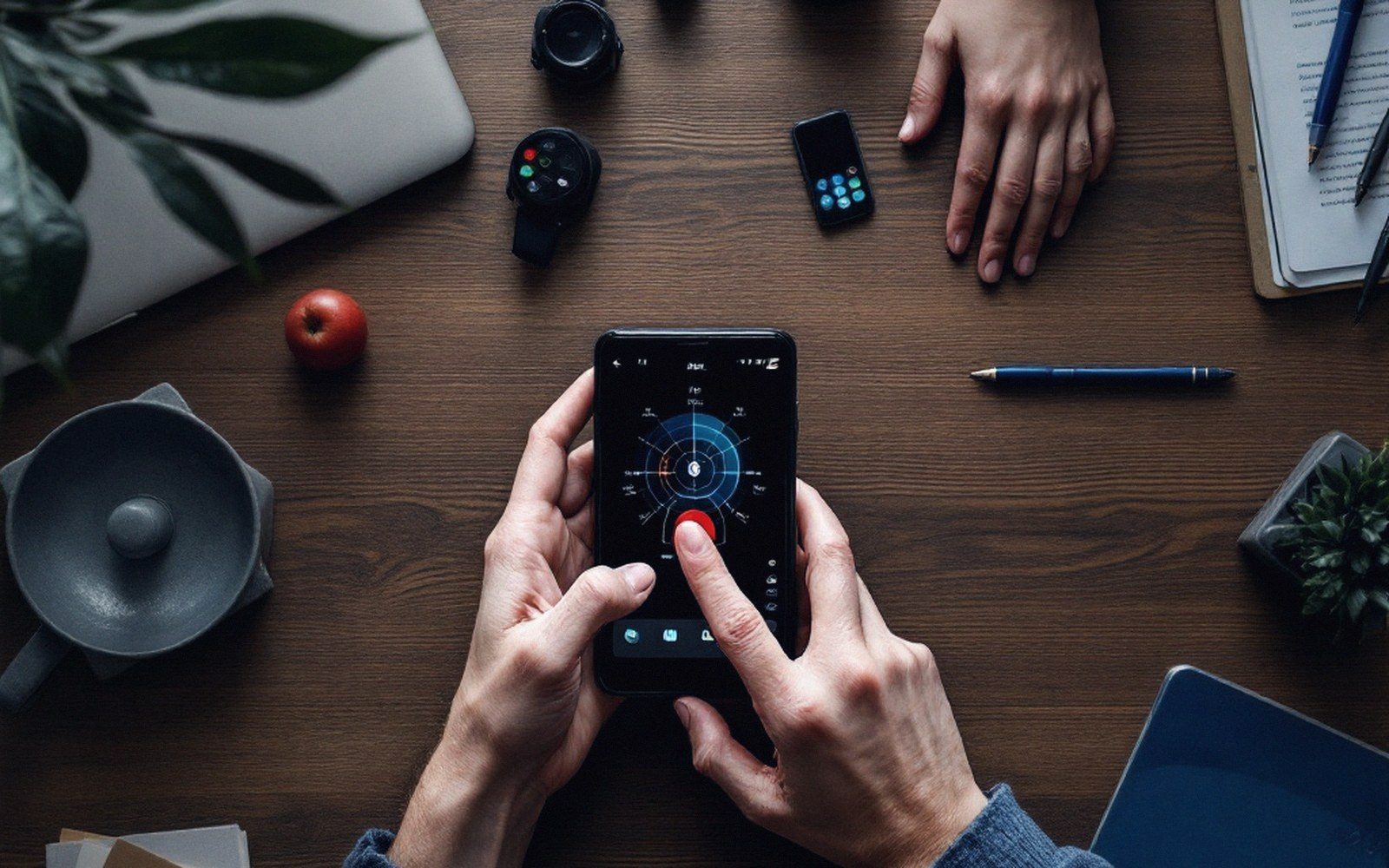
Mid-sweep. The lower corner arrives for free; the far top corner costs a regrip.
The formal principle underneath this is Fitts's law ↗: the time to acquire a target depends on its distance and its size. A target far away requires more time; a small target requires more time. Place a target far away and make it small, and it demands disproportionate effort.
The top far corner of a phone is both far from the thumb's pivot and, in most mobile interfaces, carries icons or system chrome that the designer had no hand in sizing. It is the worst real estate twice over.
Where the frequent things should live
Mobile game design treats the reachable arc as a budget. Frequent actions — the tap that plays a move, the button that spends soft currency, the drag that positions a piece — spend nothing when they land inside the arc.
Spatial concepts
Lifted out of the flow
- Reachable arc — the curved zone a thumb can sweep without shifting grip, pivoting from the heel of the hand; deepest comfort near the bottom and the dominant-hand corner
- Top far corner — the highest-cost region: farthest from the thumb's pivot, worst real estate on the screen regardless of which hand holds the phone
- Occlusion shadow — the area beneath the thumb at moment of contact; feedback placed here is invisible at the moment it matters
- Fitts's law — movement time grows with distance and shrinks with target size; the arc is the spatial expression of this principle in handheld form
Infrequent actions — settings, help menus, the button that abandons a session — can be placed in the harder zones without cost, because the player does not need them often enough for the difficulty to compound.
This logic shapes the layout of nearly every successful mobile game, though rarely explicitly. In the family of puzzle games that King popularised after Candy Crush Saga moved from browser to phone, the play field sits in the middle of the screen and interactive elements cluster toward the bottom.
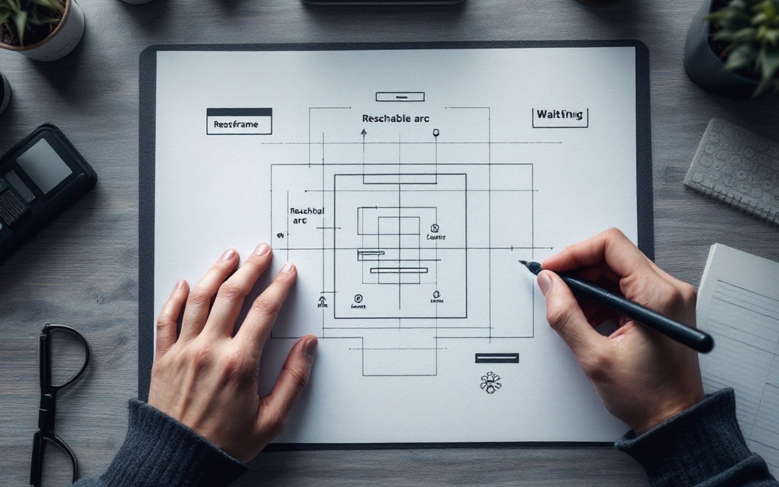
The arc is ruled onto paper before a single control is placed.
The Helsinki studio Supercell's strategy titles — Clash of Clans among them — keep the primary build-and-attack controls in the lower portion of the viewport, where a right-handed grip delivers them easily. Neither studio invented the principle; they applied it because players who strain for a button make errors and leave.
The arc also changes with device size. On the phones of the mid-2000s, when the screen was smaller, the arc covered a larger proportion of the surface — a thumb could reach almost everywhere. As screens grew through the 2010s, the top of the device moved progressively farther from the hand, and the zone of effortless reach shrank as a percentage of total area.
Frequent actions belong inside the arc; infrequent actions (settings, help) can tolerate the hard zones
This is why Apple's Human Interface Guidelines ↗ have long recommended placing primary controls low in the interface, and why Google's Material Design echoes the same principle in its layout guidance: both sets of guidelines are responses to the same physical constraint, which became more urgent as screens grew. Apple specified minimum touch targets of 44 points; Google settled on 48 density-independent pixels. The numbers differ; the reasoning is identical.
Occlusion complicates the picture further. The hand that holds the phone covers a portion of its own lower-right quadrant — the exact region that is most comfortable to reach. A control placed beneath the thumb is easy to hit but impossible to see at the moment of contact.
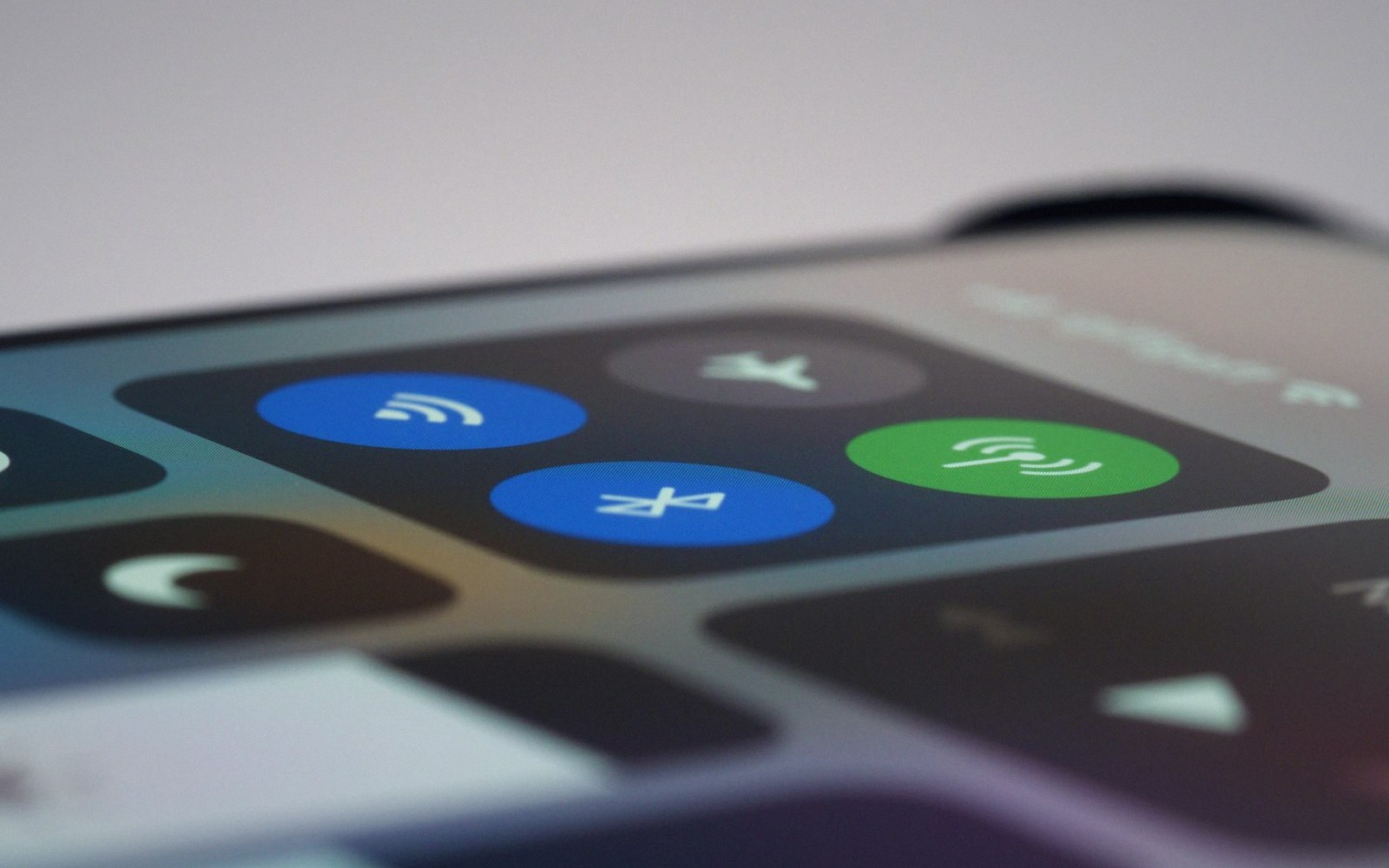
System chrome the designer never sized sits exactly where the thumb is weakest.
Photo: Brett Jordan / Pexels
Good mobile game design accounts for this by placing the most critical feedback above the likely point of contact, so the result of a tap is never hidden by the finger that triggered it.
The two constraints — reach and occlusion — pull in the same direction in one sense (both push activity toward the lower screen) and in opposite directions in another (occlusion demands that feedback rises out of the thumb's shadow).
Design decisions the arc forces
The reachable arc is not merely a layout rule; it exerts pressure on structure. When a game demands frequent movement between two controls — say, a draw button and a confirm button — placing them far apart on opposite sides of the screen means the thumb must traverse its full range on every cycle.
Also worth having to hand
Lifted out of the flow
Physical forces on layout
- Paired controls that a player alternates between should sit in the same arc band to avoid full-range traversal on every cycle
- Screen growth through the 2010s shrank the comfortable proportion of the surface — the arc problem worsened as phones grew
- Left-handed players face a mirrored disadvantage in most single-layout games; few casual titles address this
Over a session of any length, this accumulates into fatigue. The response, which experienced mobile designers reach for reflexively, is to keep frequently paired controls close together, ideally within the same band of the arc so that the thumb barely needs to shift.
Handedness creates an asymmetry that designers rarely handle gracefully. A layout optimised for a right-handed player puts its comfortable zone at the bottom-right; a left-handed player's comfortable zone is at the bottom-left, which is the right-handed layout's hard region. Most mobile games ship a single layout and accept that left-handed players are somewhat disadvantaged.
A minority of designs — more common in precision genres than in casual ones — offer a mirrored layout option. The asymmetry is documented but frequently deprioritised; the economics of casual games treat a modest disadvantage for a minority as an acceptable compromise when the cost of supporting both layouts falls on a small team.
The arc also informs tutorial design. A first-level interaction that teaches the player a gesture will succeed more reliably if the gesture is placed inside the reachable zone. Teaching by making the wrong move impossible is easier when the right move is also the physically comfortable one.
When the two align — correct action and comfortable position — the tutorial does less work, because the body is already inclined toward the right choice. When they conflict, the tutorial must do more, and teaching without text becomes harder precisely where it needs to be easiest.
Finally, the arc has a temporal dimension. A session that begins in a comfortable posture — one hand, thumb relaxed, phone held at middle height — may shift as the player settles into a chair, a seat, a waiting room. The grip migrates; the hand may switch; the phone may end up in a two-handed cradle.
Designs that depend on one-handed arc comfort can become awkward as the session extends and posture drifts. The most robust mobile game layouts keep critical controls far enough from the margins to be reachable in multiple grips, so that the design survives the transition even if it was optimised for the first.