The first sixty seconds
The opening minute of a mobile game is the most expensive real estate in the entire product.

Most of the players who leave, leave here.
Photo: Image Hunter / Pexels
The problem at the door
Abandonment data is unambiguous: the steepest drop on any retention curve happens before the end of the first session. Many players who will never return have already decided within a minute of opening the game for the first time. The cause is almost never technical — it is experiential. The player felt nothing, or felt confused, and left.
That constraint shapes everything that appears in the first sixty seconds. The designer cannot afford a preamble. Loading screens, unskippable cutscenes, lengthy account-creation flows — each one is a door held slightly closed. Every second spent before the player touches something interactive is a second in which the session can end for free, with no friction, and the player has no reason to stay.
The opening is the most designed minute in the game.
Photo: Solen Feyissa / Pexels
The opening is therefore not an introduction. It is a sales argument made entirely through play.
What the first minute has to do
The work is threefold, and it has to happen nearly simultaneously. The game must teach the core mechanic, deliver a first emotional reward, and signal the loop that will run for the next thirty days — all before the player has consciously decided whether they like it.
The three jobs of the opening
Lifted out of the flow
- Teach the core mechanic — through constrained play, not text
- Deliver a first emotional reward — fast, clear, disproportionately generous
- Signal the loop — make the next session feel like a natural consequence
Teaching without text is the dominant convention here. The level is constrained so that only the correct move is available; failure is deflected. The player cannot lose, not because the game is generous but because losing before the player understands the mechanic is incoherent.
Rovio's early Angry Birds levels place a single pig behind a single block of glass and put the slingshot in front of it; the geometry teaches trajectory before the word "trajectory" appears. King built its first Candy Crush Saga levels so that only one move clears the board cleanly — the player solves the puzzle without knowing they were taught.
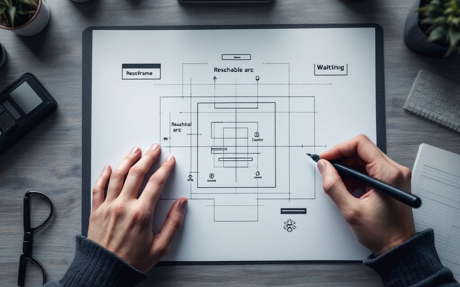
First-run flows are storyboarded frame by frame, tap by tap.
The emotional beat matters as much as the tutorial beat. The first reward has to arrive fast, land clearly, and feel proportionate. Visual and audio feedback — burst particles, a satisfying sound, a score counter climbing — do work that text cannot. The player needs a hit of competence before they have earned it through skill, because skill takes time to develop and the game does not have time.
The third task, signalling the loop, is the subtlest. The first sixty seconds should make the next sixty seconds feel inevitable. If the player understands, however intuitively, that there is more of this — more levels, more building, more progression — they have formed an intention, and intention is the bridge between a first session and a second.
The design pressure this creates
What looks effortless in a polished opening is usually the product of extensive playtesting around a single metric: how far does a new player get before they stop? Supercell, whose small Helsinki-based teams work in tight loops of prototype and player testing, is known for discarding games that fail to hold new players through early sessions before wider release. The first minute is not a creative statement; it is a measured threshold.
Removing friction accelerates progress but can eliminate meaningful choice
That measurement creates its own pressure. When abandonment at sixty seconds is a known quantity, there is an incentive to remove every obstacle to forward motion — including the ones that might be meaningful.
Tutorials can become coercive, ushering players through scripted gestures with no room for exploration. The opening can be optimised into a kind of soft compulsion: every friction filed away, every pause eliminated, the player moved along a track they never chose.
Also worth having to hand
Lifted out of the flow
The design trade-off
- Tutorials optimised for retention metrics may feel coercive rather than instructive
- The opening is the point where player interest and designer interest overlap most completely — and most uncomfortably
Ian Bogost's critique of social and mobile games — that they are systems of obligation dressed as entertainment — bites hardest at the opening, where the design's goal and the player's goal are most nakedly identical: keep moving forward. The question the first sixty seconds never asks is whether the player wants to be here. It assumes that if you make staying easy enough, wanting follows.
Whether that is good design or a refined form of capture is the argument that runs beneath every polished tutorial, every perfectly timed first reward, every level that holds the player's hand so firmly they never notice it.